
Swanson
We partnered with Swanson on a Bone Broth packaging refresh to continue to win the battle at shelf in the burgeoning bone broth segment.
Capabilities
Packaging Design
Photography
Challenge
While the bone broth segment is relatively small in the broth/stock category, it is a growth engine accounting for a disproportionate amount of category growth. Swanson’s Chicken Bone Broth is the #2 branded player in the segment, and they wanted to protect their leadership status with a relevant and differentiated label. Additionally, following on the heels of a brand refresh, they wanted Bone Broth to align with revised brand elements.
Action Taken
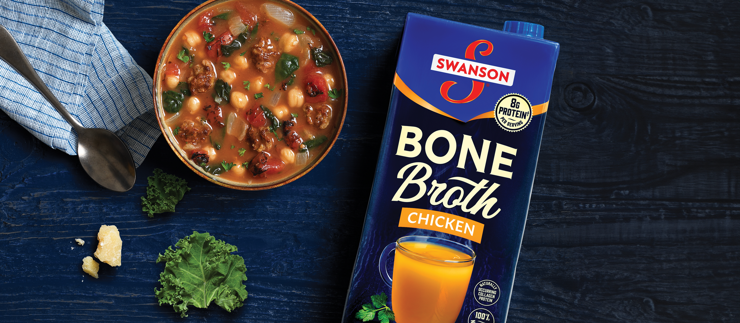
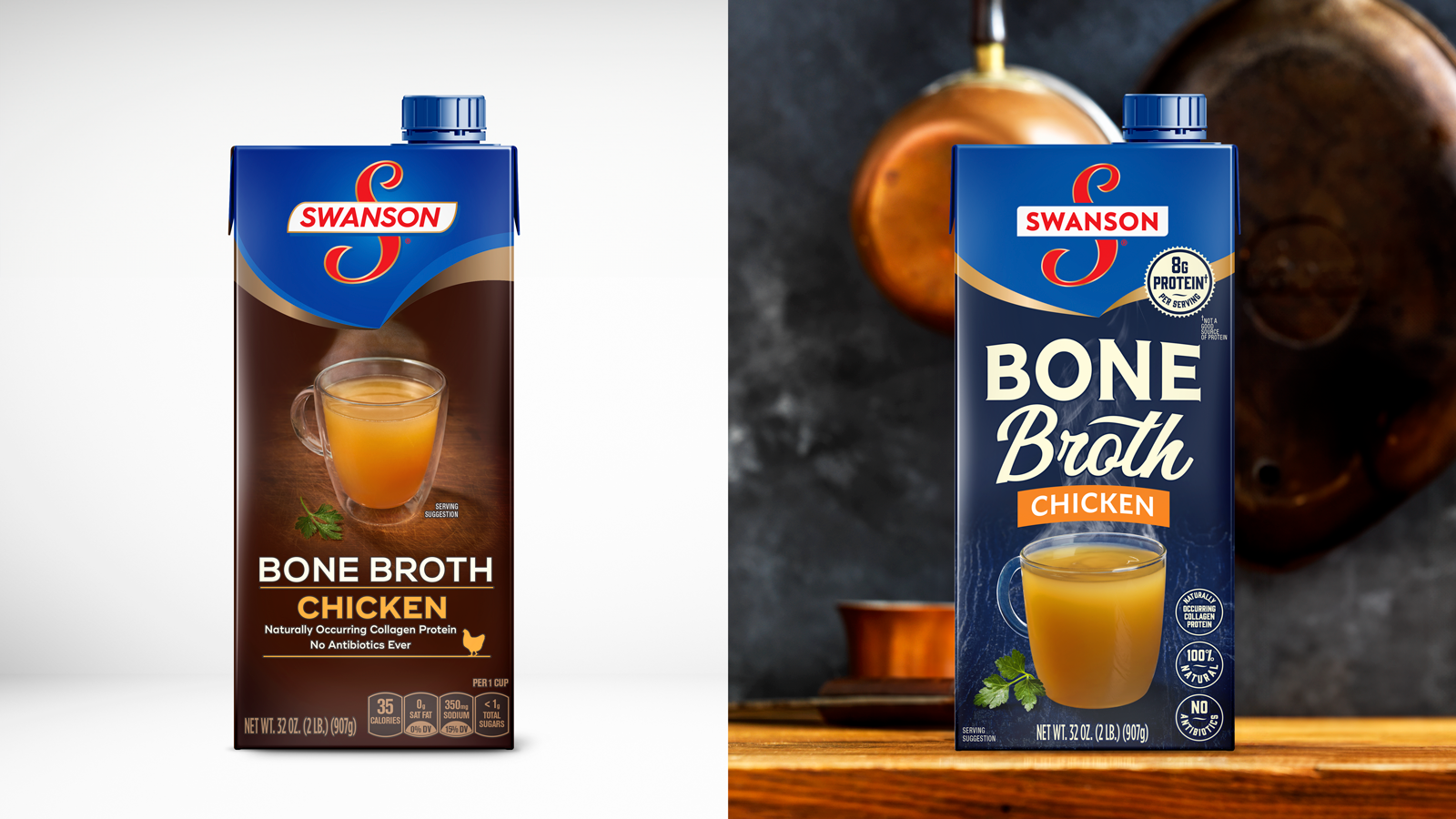
DuPuis partnered with Swanson to help Bone Broth stand out in the category as a modern player that’s heartier and more rustic than traditional broth and has a natural health benefit. We began by developing a design strategy to position Swanson as the more premium option, exploring several packaging directions that worked cohesively in both tetra and sippable cups. Post-research, we refined the winning packaging and shot final photography across 4 SKUs. The rich navy blue background reflects the richness in the product itself and differentiates Bone Broth as a segment within the larger Swanson broths and stocks portfolio, while the design overall conveyed strong appetite appeal and healthfulness.
Results
The new packaging has rolled out nationally and nicely aligns with the core Swanson broth line, while still standing out on shelf as a unique offering with both premium taste and health benefits.

You May Also Like