
Pretzilla
We partnered with Pretzilla to refresh their branding and packaging to modernize the brand and position them for line expansion.
Capabilities
Branding
Packaging Design
Consumer Insights
Photography
Challenge
As Pretzilla grew since its launch in 2010, its branding & packaging remained largely unchanged and did not keep up with the pace of innovation in the brand and market. As the competitive field grew more crowded, the beloved brand wanted to refresh its packaging to better support its premium positioning and prepare it for growth into different categories and line extensions.
Action Taken
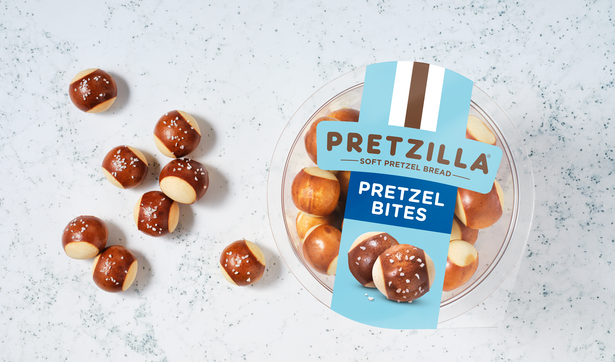
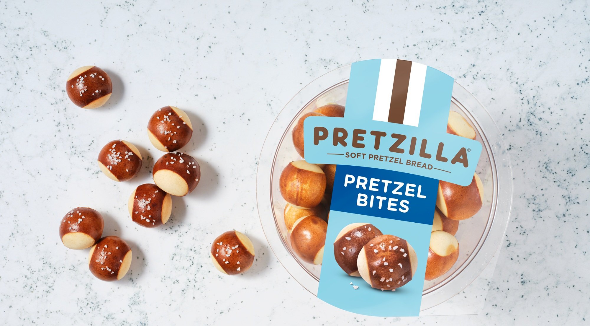
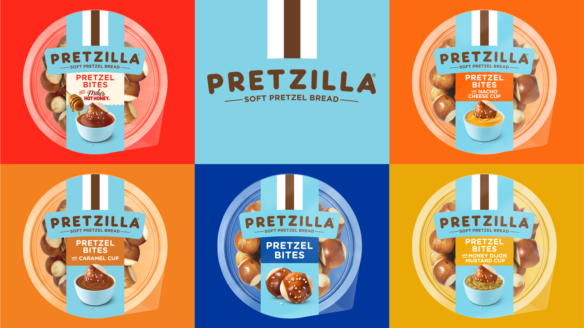
DuPuis partnered with Pretzilla to modernize & premiumize the brand and develop a cohesive design architecture that could span new categories and formats. We developed several ways-in to modernizing the packaging, extending them to different lines to better assess shelf pop across categories. We then conducted consumer research to understand which design had the most potential and how to optimize it. From there, we finalized the design and extended it to all existing SKUs and new products in development. Our Flashlight Studio captured hero product photography that added taste appeal on the packaging, and the light blue signature color and vertical stripe make the brand immediately identifiable in frozen, in bakery and in the bread aisle.
Results
The cohesive, refreshed packaging began rolling out on shelf in September 2024.

You May Also Like